Writing Wednesday — Judge Easterbook on Fonts
June 5, 2024Legendary Seventh Circuit judge Frank Easterbrook has written authoritatively on many topics. Thanks to AsymaDesign, LLC v. CBL & Assocs. Mgmnt, Inc., the choice of a good font is now among them.
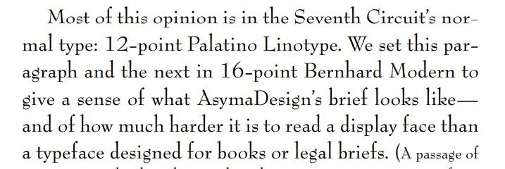
Judge Easterbrook noted that he was writing in Palatino Linotype, the standard font of the Seventh Circuit (and one of two that I regularly use, alternating with Book Antigua). He explained that it’s a desirable font for legal writing because it has a large “x-height” (the height of a lowercase “x” compared to a capital letter), along with similar fonts designed for book publication:
 The Appellant made the unfortunate choice of Bernhard Modern, a “display face suited to movie posters and used in the title sequence of the Twilight Zone TV show.” Because of that font’s low x-height, it’s hard to read in book-like writing:
 He concluded: “We hope that Bernhard Modern has made its last appearance in an appellate brief. “